Designing a Collaborative Travel Planning Experience

Project Context
Role: UX Designer
Timeline: June – October 2024
Responsibilities: Research, Wireframing, Prototyping, Branding, Usability Testing
Collaborators: Gavyn Ikegami (UX designer), Issac Reed (UX Researcher)
What is this Project about?
As a UX designer, I designed a Japan travel planning app that helps users discover authentic experiences, plan itineraries, and collaborate with friends—all in one place.
My contributions included conducting user research, defining design requirements, and creating a prototype that feels intuitive and visually engaging for travelers.
Product/Organization Goals
-
Create a centralized platform for discovering activities, planning trips, and sharing ideas.
-
Design a clean, modern interface that works even with limited connectivity.
User Goals
-
Find personalized recommendations quickly.
-
Plan and organize trips without juggling multiple apps.
-
Coordinate with friends easily through shared folders and polls.
Research
User Research:
I began the design process by conducting user research about travel planning
Internet Search:
Most travelers prefer planning ahead to avoid surprises.
-
72% of users research destinations online before booking.
Group coordination is a major challenge.
-
65% of travelers say planning with friends or family adds stress.
Offline access matters.
-
40% of users print itineraries due to unreliable internet during trips.
Discovery habits:
-
58% use YouTube for travel tips and reviews.
-
52% rely on Google Maps for location details.
Top frustrations:
-
Fragmented tools for planning and inspiration.
Difficulty finding authentic, non-commercial activities.
User Interviews:
I interviewed three travelers to uncover pain points:
-
Vicki (63, Post Master)
Travels several times a year, values preparation and dislikes surprises. Relies on printed itineraries due to unstable internet. Biggest challenges: packing, finding free activities, and coordinating with family.
-
Chris (28, Pharmacist)
Comfortable traveler but stressed by logistics and documentation. Loves bucket-list experiences but struggles to find reliable info on local spots. Uses Google Maps pins and physical planners. Wants better integration for flights and shared plans.
-
Andy (45, Financial Analyst)
Frequent traveler who values flexibility and quick access to recommendations. Frustrated by fragmented tools and long decision-making times. Wants a single app for inspiration, planning, and group coordination.
Key Findings about AI:
-
Users want one central place for ideas, planning, and sharing.
-
Offline access and physical itinerary options matter.
-
Group coordination and polling for decisions are highly desired.
-
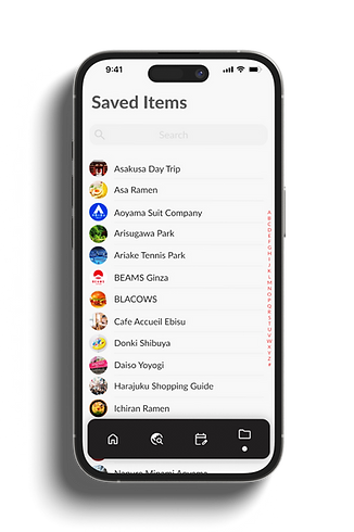
Discovery should include authentic, non-commercial activities.
Define
Design Requirements
-
Goal: Make trip planning feel exciting and collaborative without overwhelming users.
-
Simplicity: Avoid clutter; keep screens clean and modern.
-
Familiarity: Use standard navigation patterns for quick adoption.
-
Engagement: Highlight unique features like swipe-based discovery and social sharing.
Develop
Ideation & User Flow
I started with brainstorming and sketches, then created a user flow in FigJam to map out tasks like discovering activities, saving ideas, and building itineraries.


Prototype development

Ideation & User Flow
-
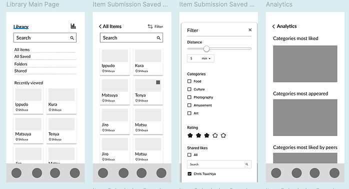
Before finalizing detailed design specifications, I created low-fidelity wireframes to establish the core layout and functionality. This step allowed me to validate navigation patterns and overall structure before moving into high-fidelity design.


Visual Design
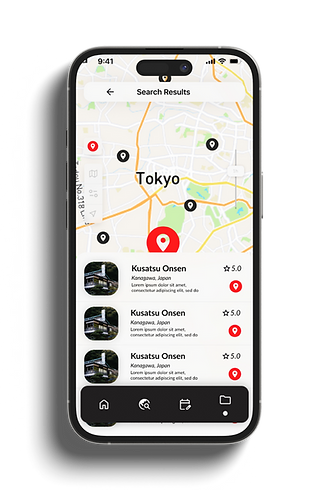
I developed a comprehensive design specification to ensure consistency across the app. The guide included typography hierarchy (Lato font family), color palette, icon styles, grid system, and component guidelines. It also showcased examples of key screens
Design Spec

Deliver
Usability Testing
I conducted usability testing with three participants to evaluate core features like discovery, itinerary building, and group coordination.
Key Findings:
-
Swipe-Based Discovery: All users found the swipe interaction intuitive and engaging for browsing activities.
-
Map Integration: Participants appreciated the integrated map for visualizing locations and distances.
-
Offline Access: Two users requested an offline mode or printable itinerary for better reliability during travel.
-
Polling Feature: All users valued the group decision-making tool for simplifying coordination.
Next Steps:
Enhance offline functionality, add clearer labels for interactive elements, and consider quick tutorials for unique features like swipe-based discovery.
Final Design